
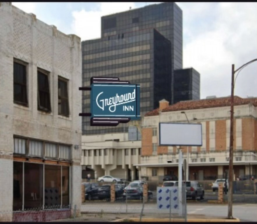
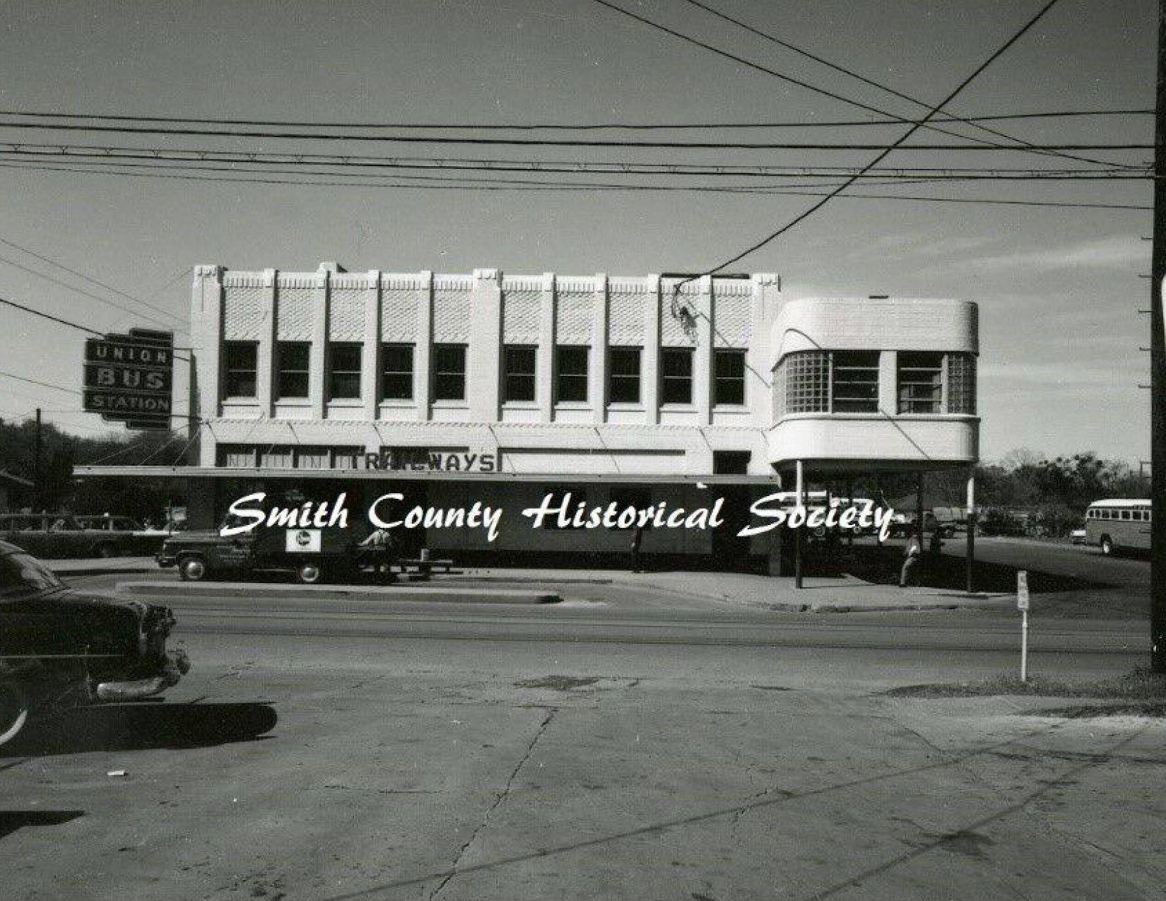
In the bustling heart of Tyler, Texas, lies a piece of history that has been gracefully transformed into an elegant boutique hotel. The Greyhound Inn, once a thriving busstation in the mid-century, stood empty and out of business for years. That was until a visionary real estate developer saw the potential to turn this vintage building into a destination hotel.
The Birth of a Logo for a Future Iconic Landmark
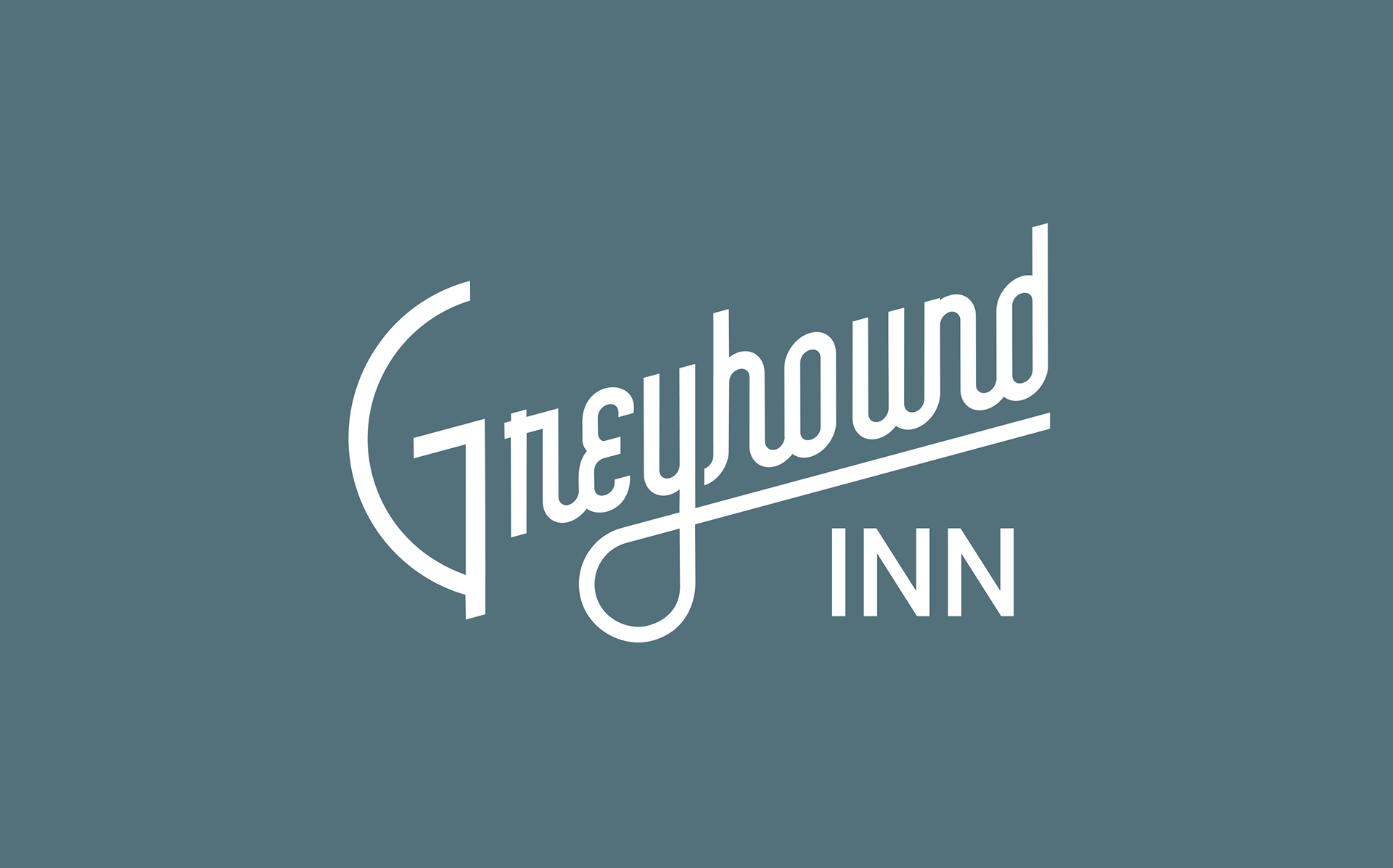
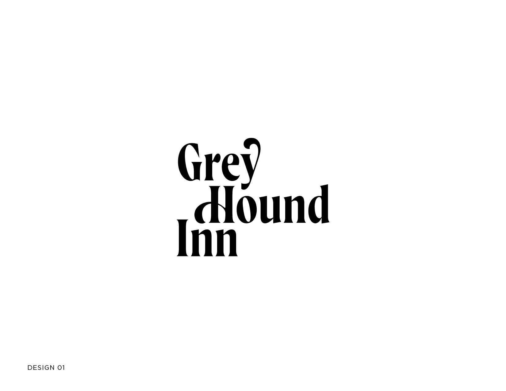
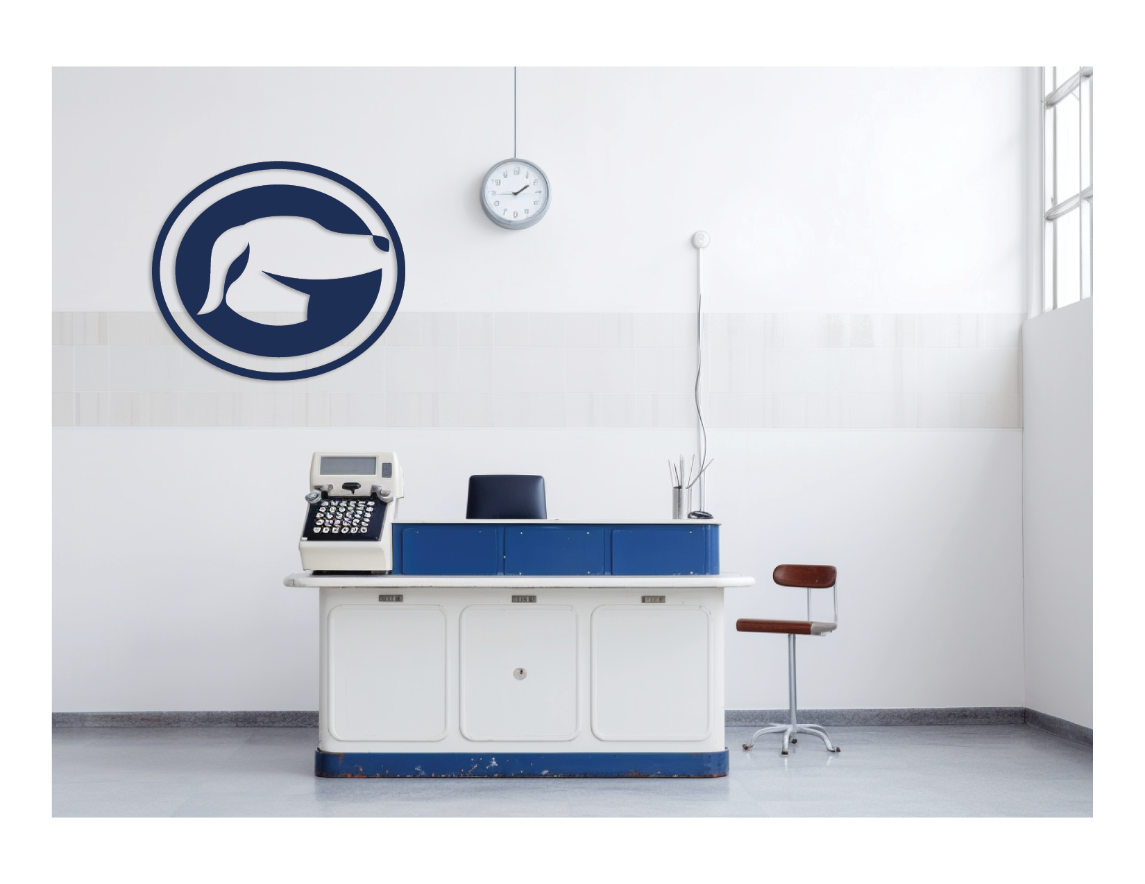
An element in creating the heart and soul of the Greyhound Inn’s transformation are its logo and neon sign. This required extensive research into the architecture of the time period, exploring old school neon signs, and exploring the art deco style.
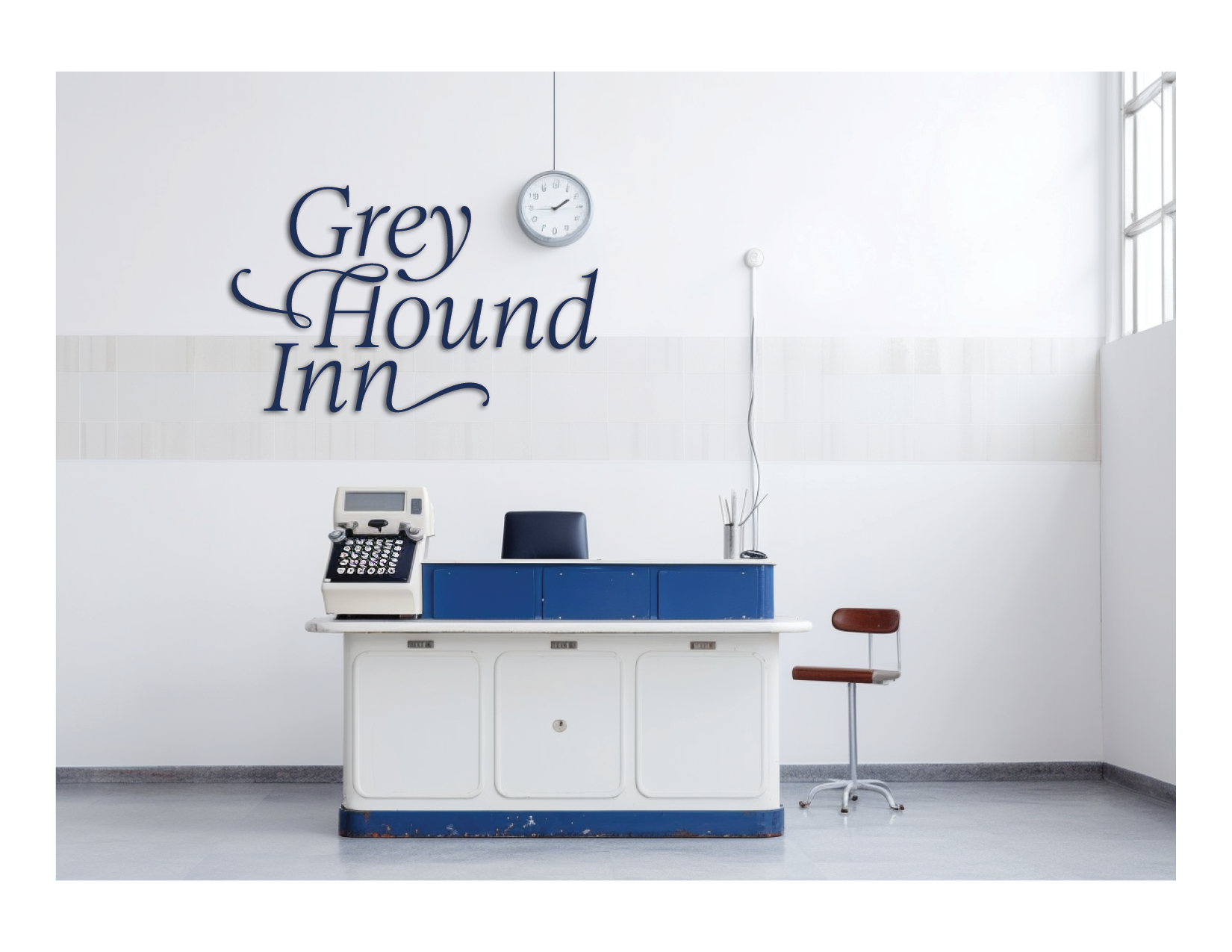
The goal was to craft a typographic logo mark that encapsulated the essence of the original Greyhound bus station. Rather than an icon, the focus was on typography, reflecting the vintage vibe. Different typefaces were explored, along with icons that could symbolize a connection with the place's history.
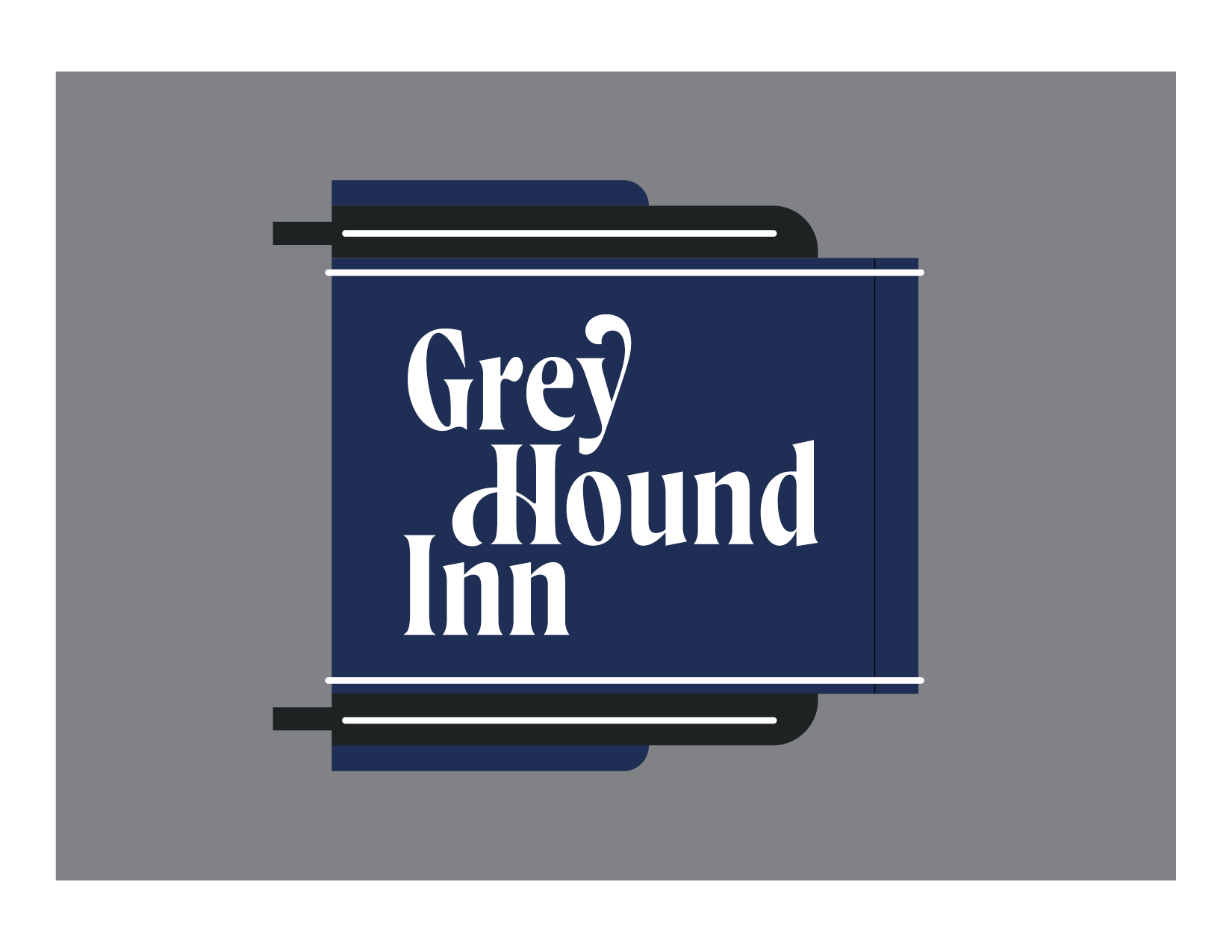
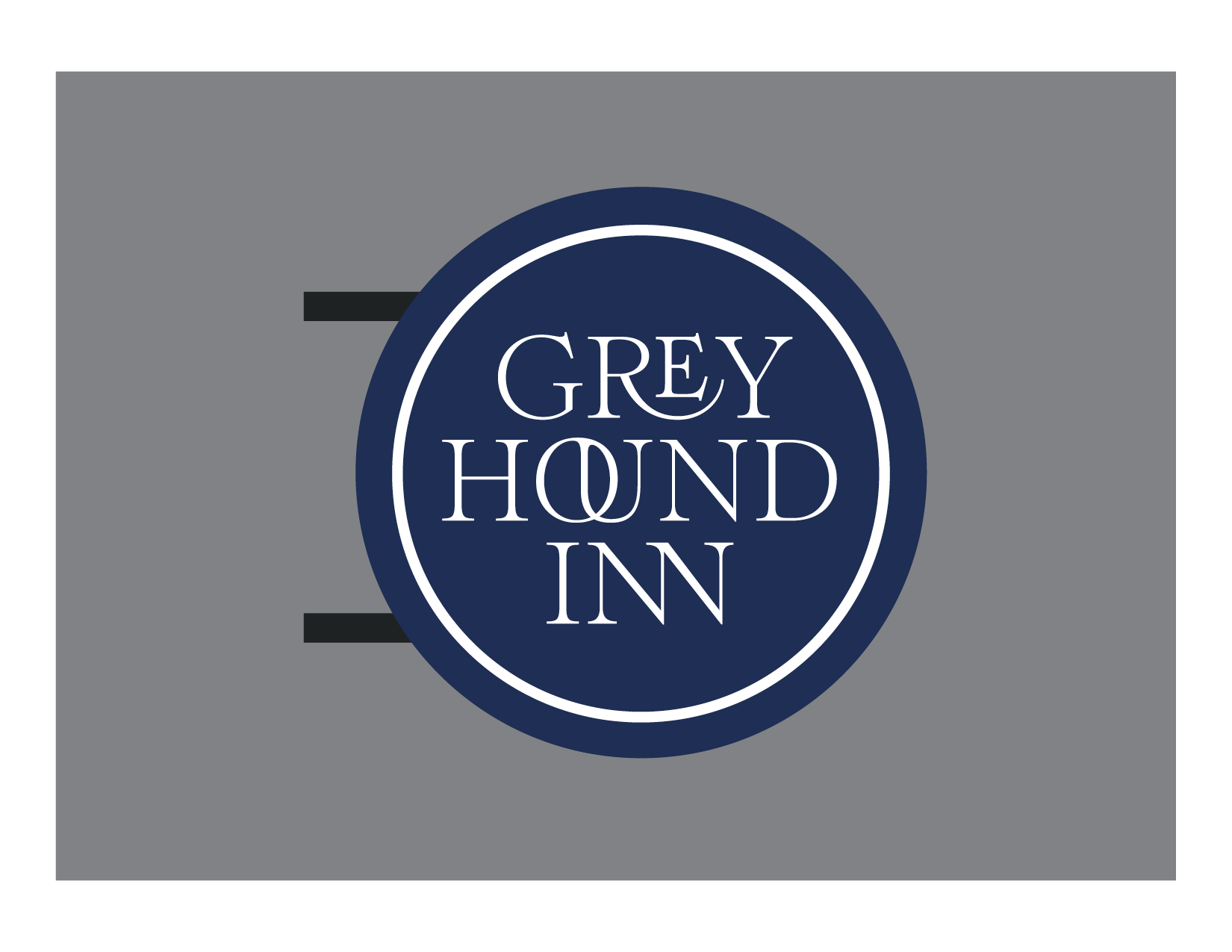
Creating a Photo-Worthy Neon Sign
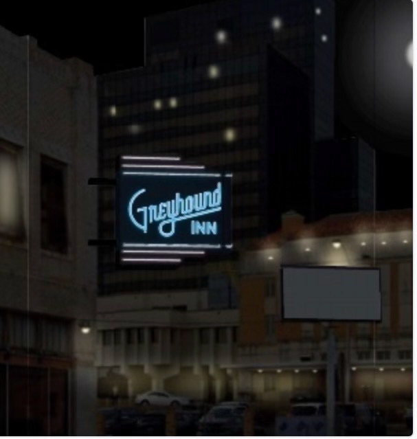
The neon sign is not just a piece of branding; it's an invitation to a unique experience. It's a symbol that had to be carefully and intentionally designed to inspire Instagram-worthy moments.
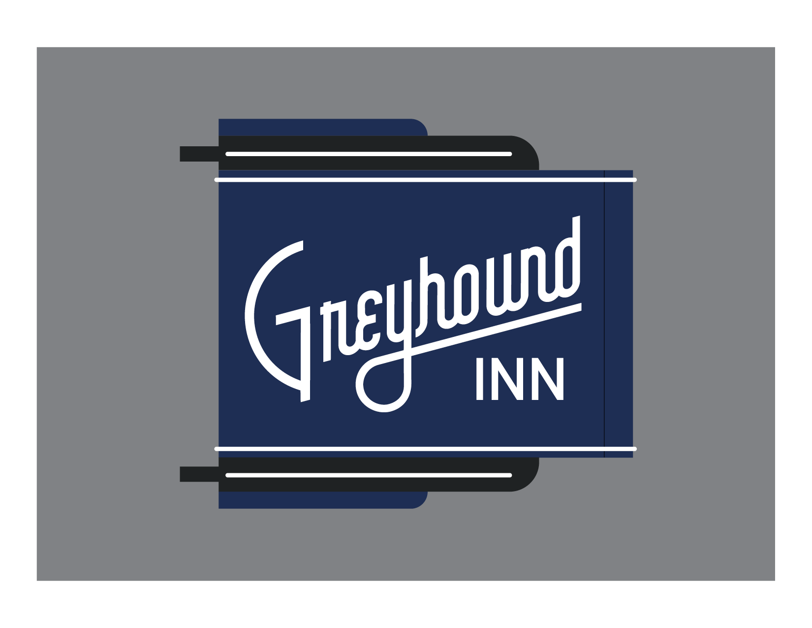
Initially, there was already a basic design for a neon sign. However, I advocated for designing the sign around the logo to ensure the dimensions were in harmony. This involved modifying the proportions of the sign to complement the final logo. The goal was to create a sign that looked designed, intentional, and balanced.
Fine-Tuning the Details
Detailing extended beyond mere shapes and sizes. Opinions were specified about the color of the neon, how the neon letters should be created, and the paint color of the sign and letters. Whether the tubes of neon were single tubes or outlined the letters was also a consideration.
Rough renderings of what the sign might look like in the day and at night were created, allowing both the client and vendor to visualize the design. It was essential to communicate every nuance of the design, ensuring that the final product resonated with the vintage charm of the Greyhound Inn.
A Surprising Decision
One aspect of this project that stood out was the unusual swiftness with which the logo was selected. In our very first meeting with the client, a winner was chosen without any changes – a rare occurrence in the world of design. This allowed for an even more focused and streamlined process as we moved forward.

Conclusion
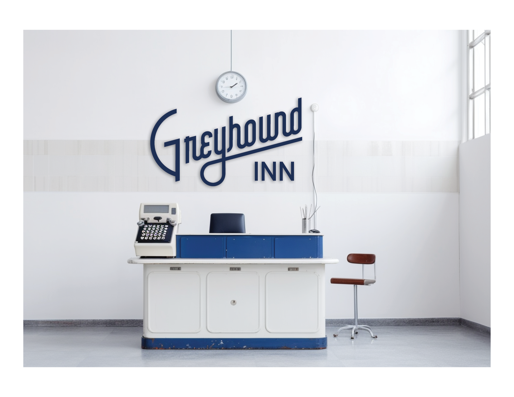
The Greyhound Inn is more than just a boutique hotel; it’s a piece of Tyler’s history, reimagined. Every aspect of the logo and sign was carefully curated to draw inspiration from the legacy of the original Greyhound bus station, but incorporate some modern sensibilities.
The journey from an abandoned station to a chic destination represents a perfect blend of nostalgia and modernity. It’s a tribute to the past with an eye on the future. This unique transformation, captured in the logo and unique neon sign, welcomes visitors into a space that is not just a place to stay, but a unique experience that they can carry with them long after they have checked out.
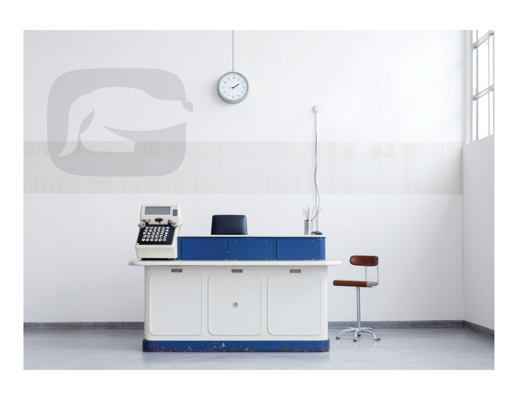
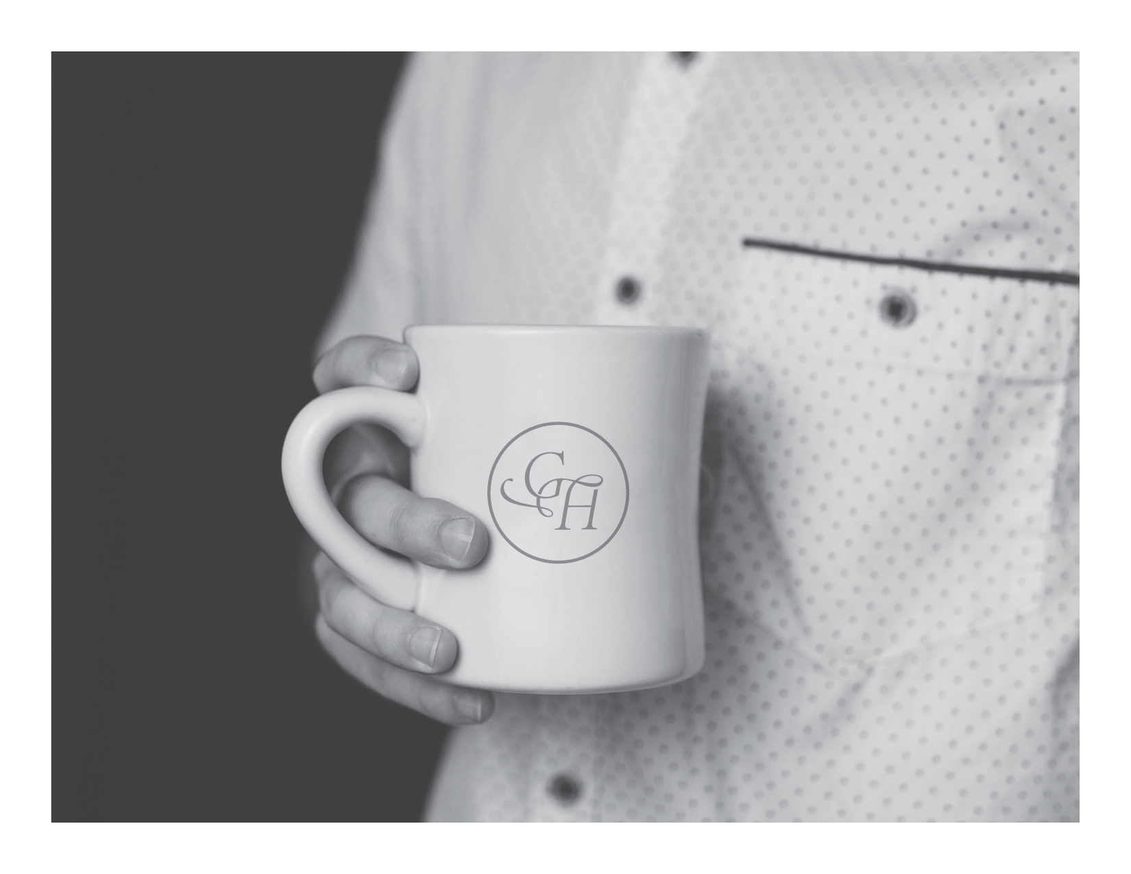

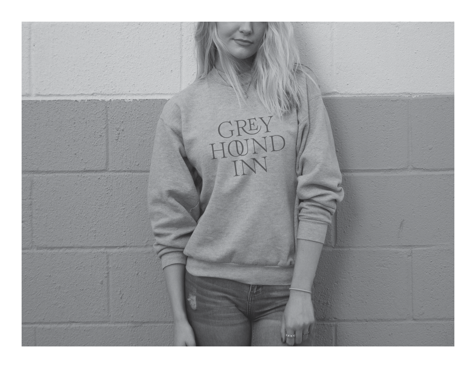
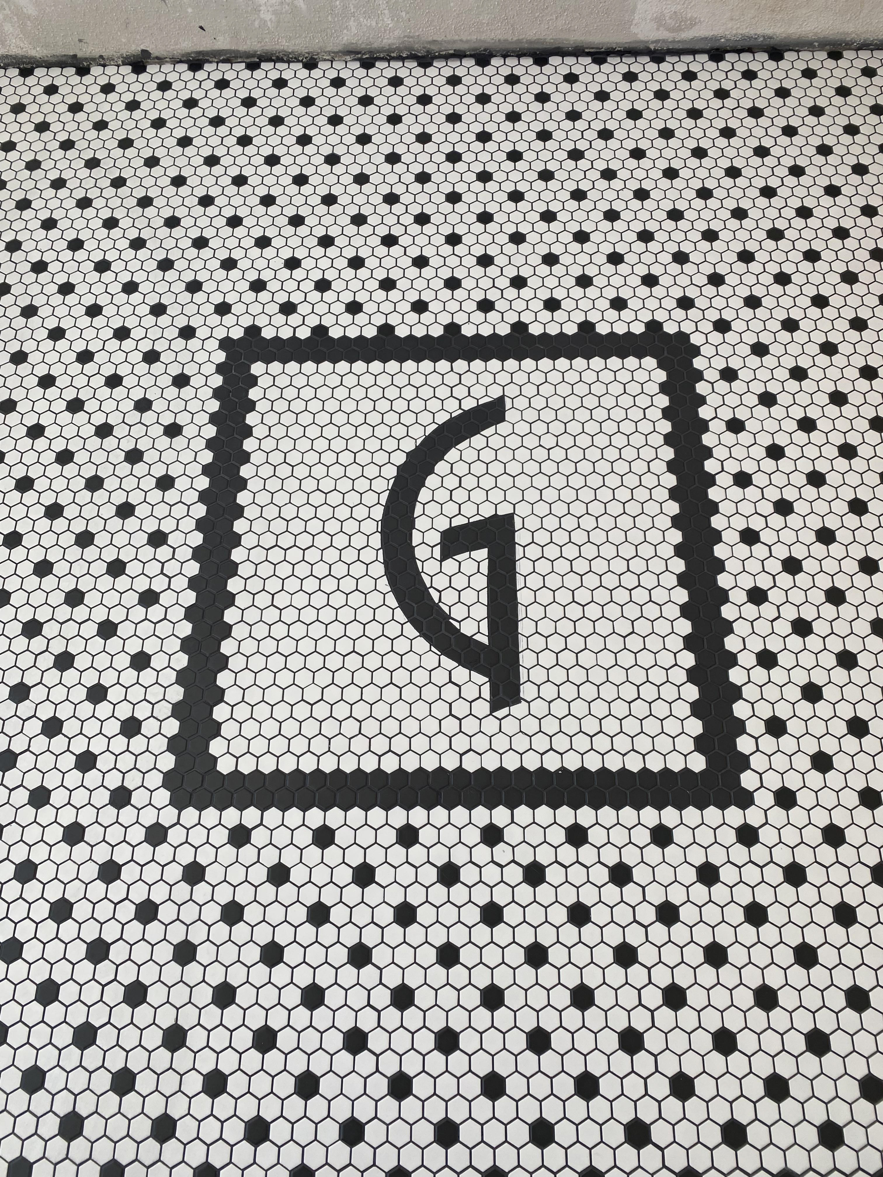
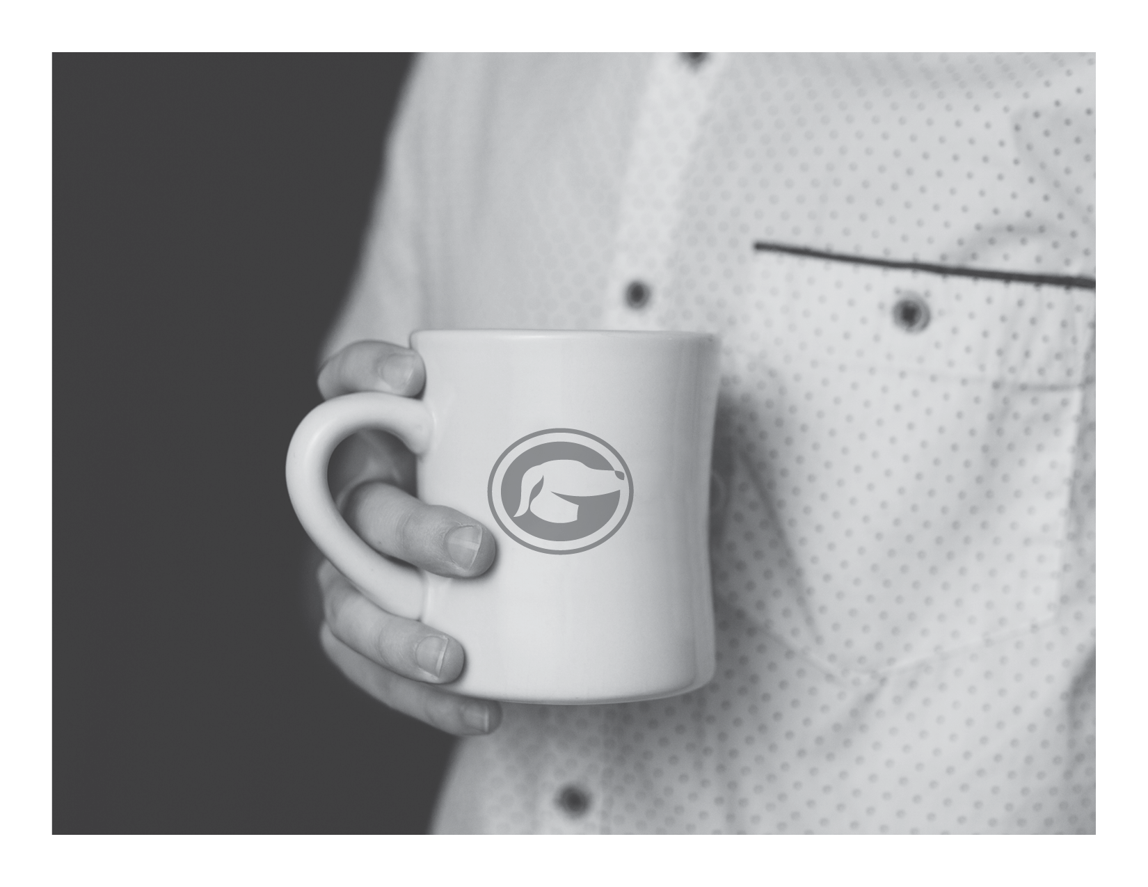
Above are a few more artifacts from the process.